Step 1: Import Comment components
- React / Next.js
- HTML
Import the
VeltComments, VeltCommentTool, and VeltCommentBubble components.Step 2: Add Comments component with Popover mode
Add the Comments component to the root of your app and enable Popover mode. This component is required to render comments in your app. Popover mode means comments can be attached to specific target elements (similar to Google Sheets).- React / Next.js
- Other Frameworks
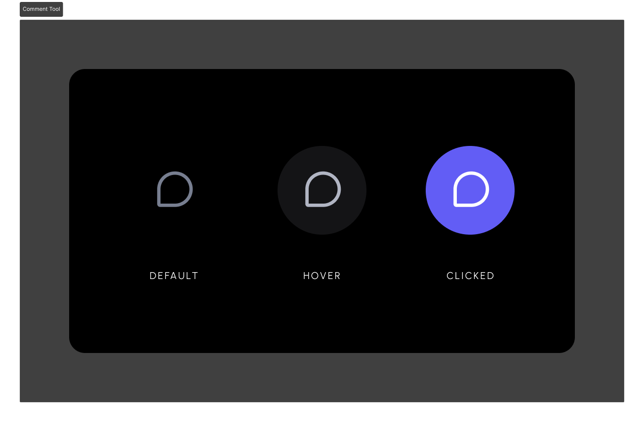
Step 3: Add the Comment Tool component
There are two patterns for adding the Comment Tool:- Add a Comment Tool next to each element you want to comment on
- Have a single Comment Tool and use it to pin comments on elements
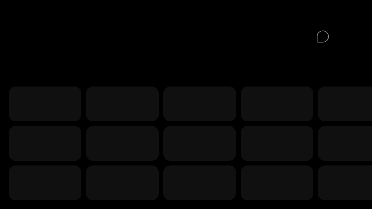
a. Comment Tool next to each element
Add a Comment Tool near each cell or element you want to comment on. For example, in a table you could add this tool to each cell and show it on hover or right click context menu.- Add unique DOM ID to each element
- Set the
targetElementIdto match the element’s ID - When users click on the Comment Tool, it attaches a Comment to that element
- If your app is more complex and cannot have unique IDs for each element (e.g., table cell), you could also use
contextto bind the element and comment with custom metadata, which can then be used to filter, group, and render comments that match specific criteria. Learn more
- React / Next.js
- HTML
b. Single Comment Tool
- Add unique DOM ID and
data-velt-target-comment-element-idattribute to each element (both with the same value) - When users click on the Comment Tool and then click on the target element, it attaches a Comment to it
- You can only add one Comment Annotation (thread) per element with this approach
- If your app is more complex and cannot have unique IDs for each element (e.g., table cell), you could also use
contextto bind the element and comment with custom metadata, which can then be used to filter, group, and render comments that match specific criteria. Learn more
If you don’t add the
data-velt-target-comment-element-id attribute, you will be adding multiple Comment Annotations on the same element.- React / Next.js
- HTML
Step 4: Add Metadata to the Comment
- Render additional data on comments UI
- Create custom UI components
- Enable comment filtering on custom data
- Use the metadata later when processing notifications
a. Using Comment Tool
- React / Next.js
- HTML
b. Using Comment Add Event Callback
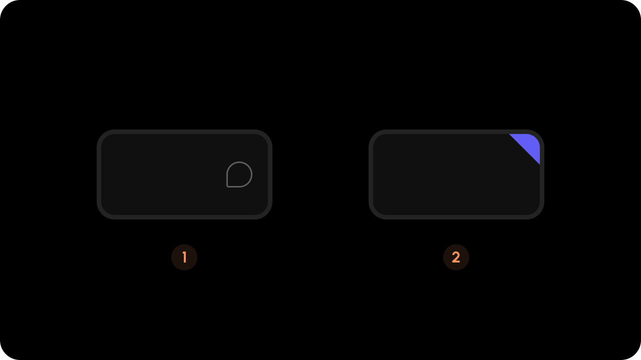
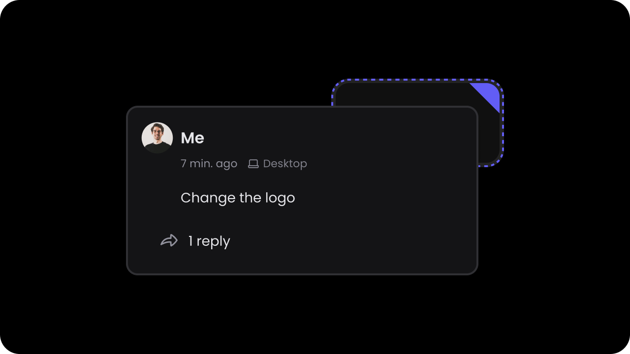
Learn more about it here.Step 5: Add the Comment Bubble component (optional)
Either use this or the default triangle component. Using both could cause visual UX issues. Turn off the triangle by setting
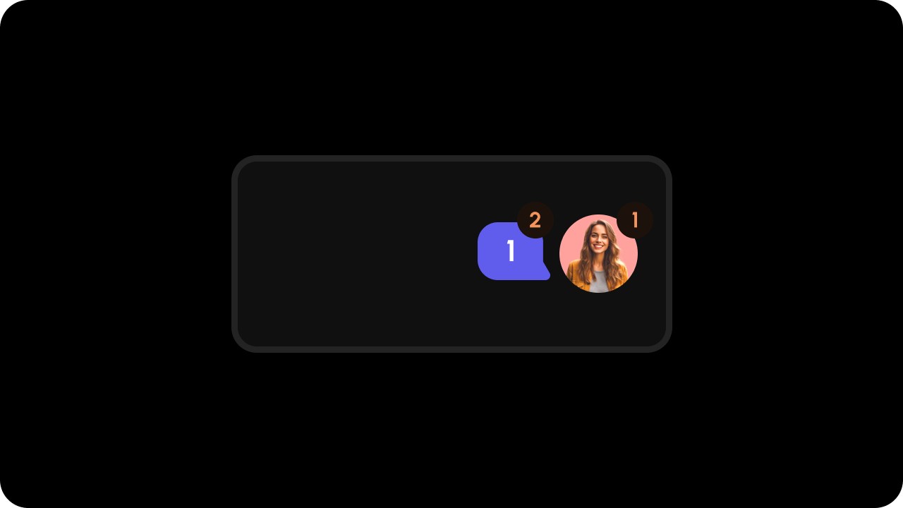
popoverTriangleComponent to false in the Velt Comments component.- Displays a count of replies for a comment thread
- Must have the same
targetElementIdorcontextas its associated element and comment tool - Can show either total replies or only unread replies
- Can be placed anywhere in your UI
commentCountType: Which count to displaytotal: Total number of replies (default)unread: Number of unread replies
- React / Next.js
- HTML
Remove Popover Mode Triangle (optional)
- React / Next.js
- HTML
Step 6: Test Integration
Test it out by opening the page with Velt components in your browser. Click on the Comment Tool and leave a comment on the target element.Complete Example
- React / Next.js
- HTML